Artopia
Photography/Illustration/Editorial
Dimension 9”x 11”
Tools Used Adobe InDesign, Adobe Photoshop, Procreate
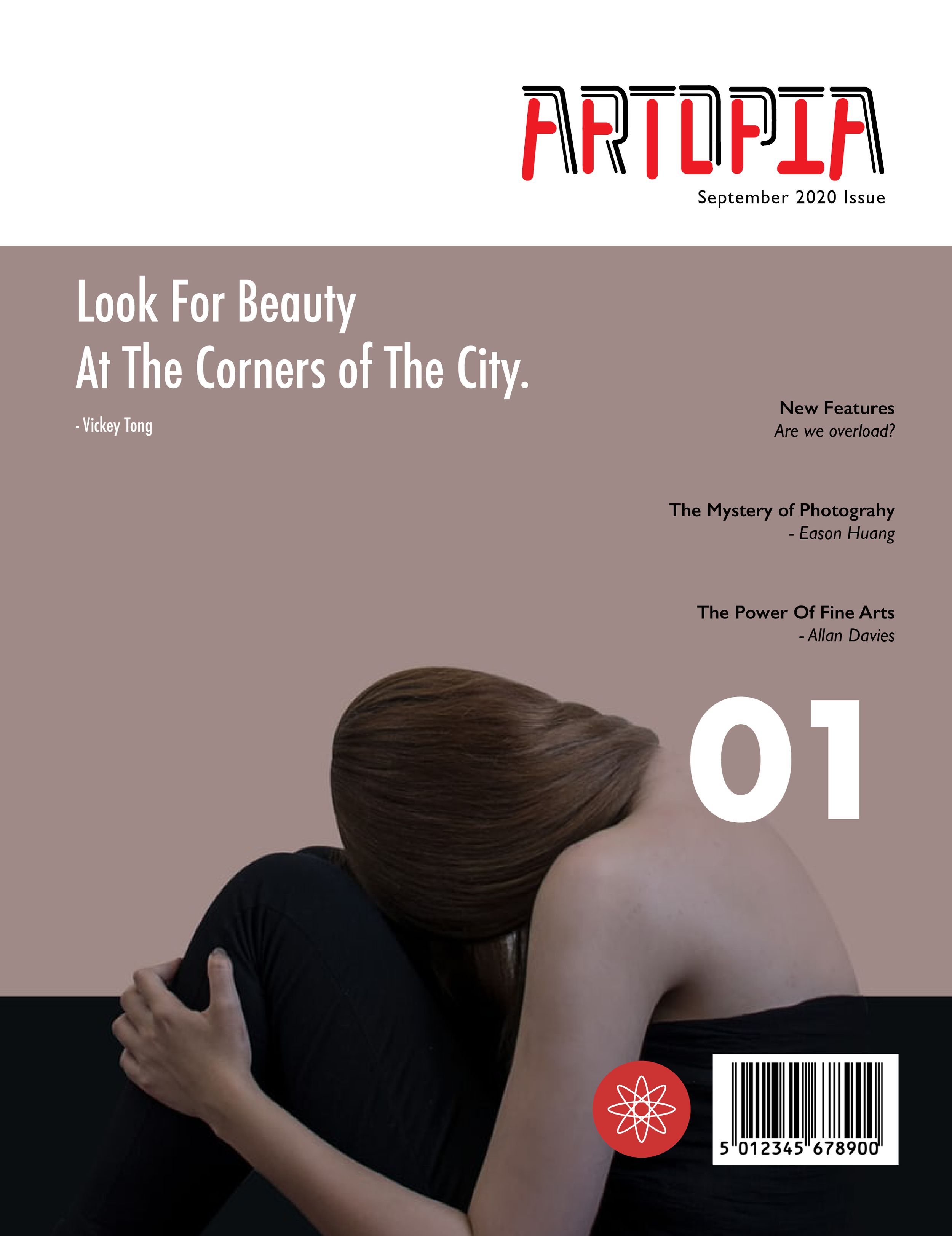
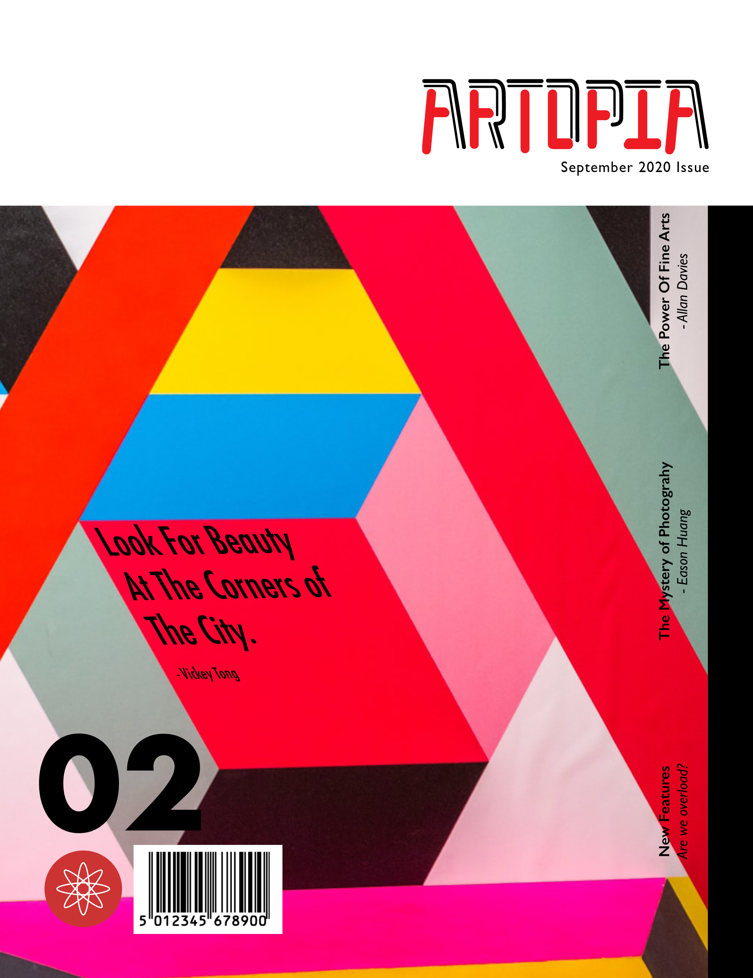
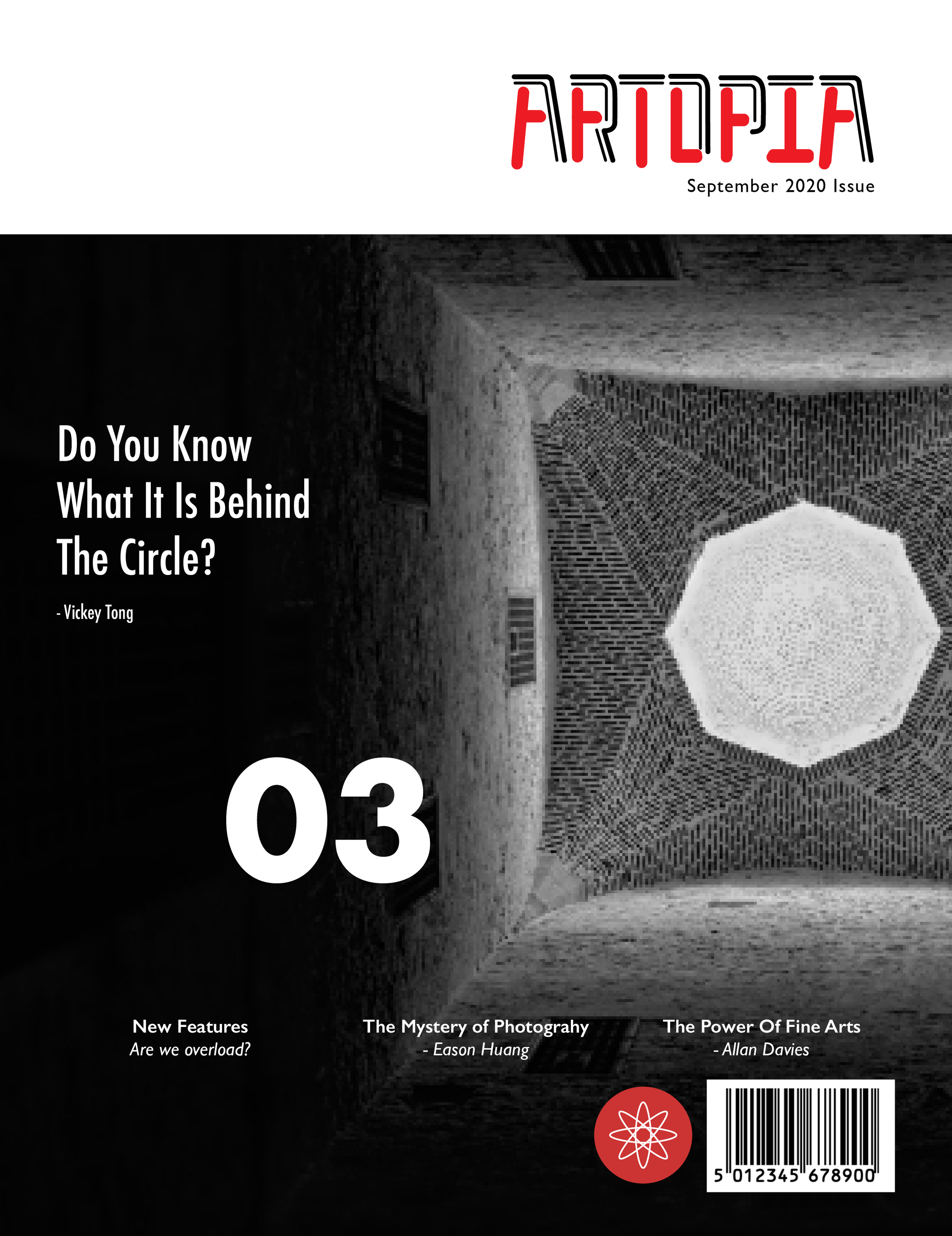
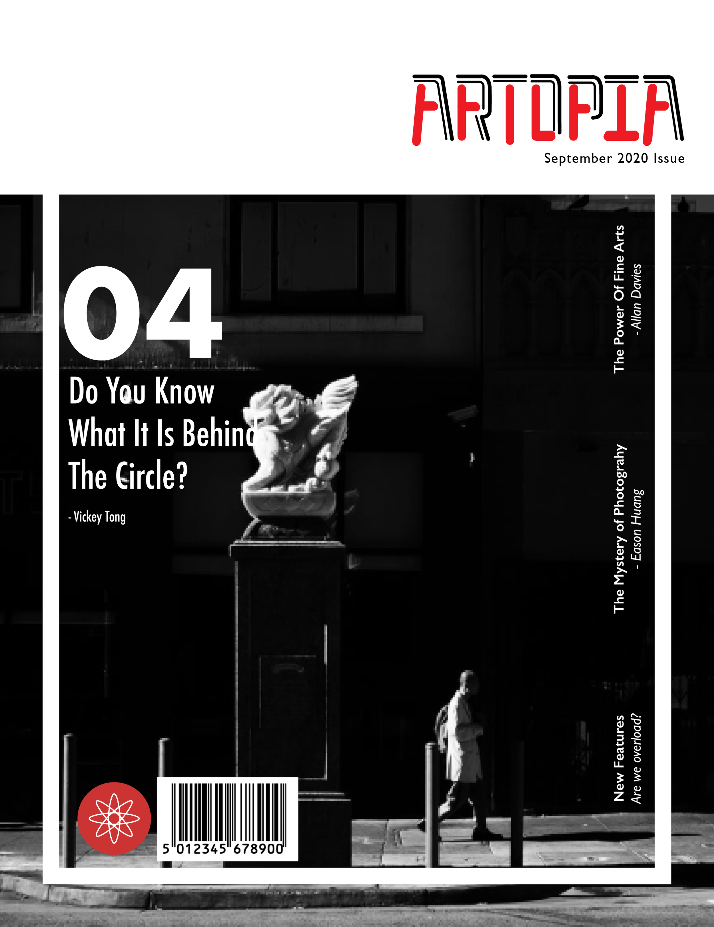
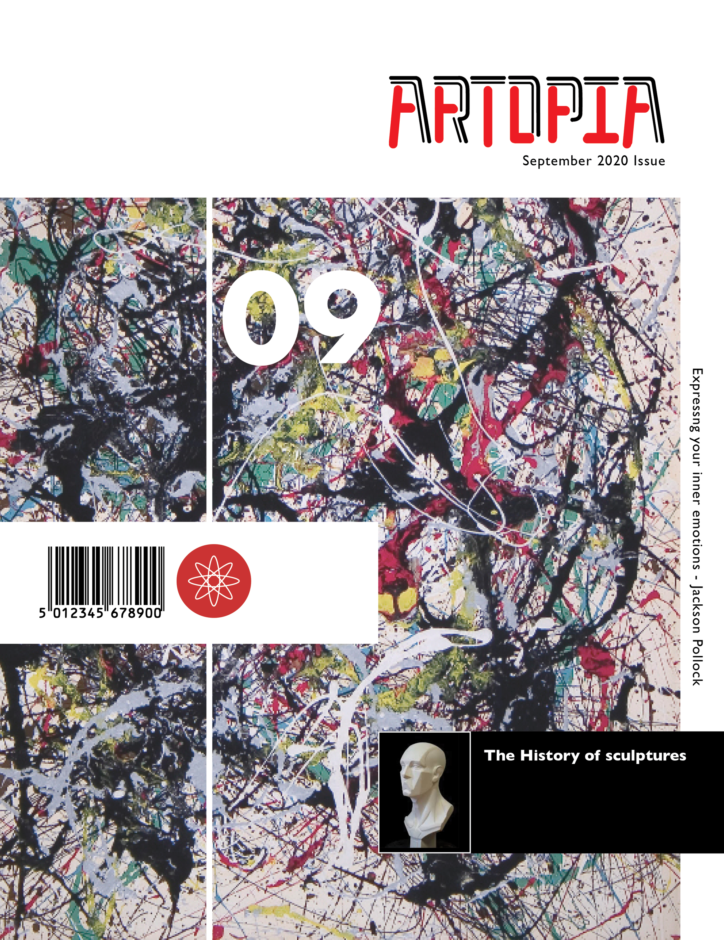
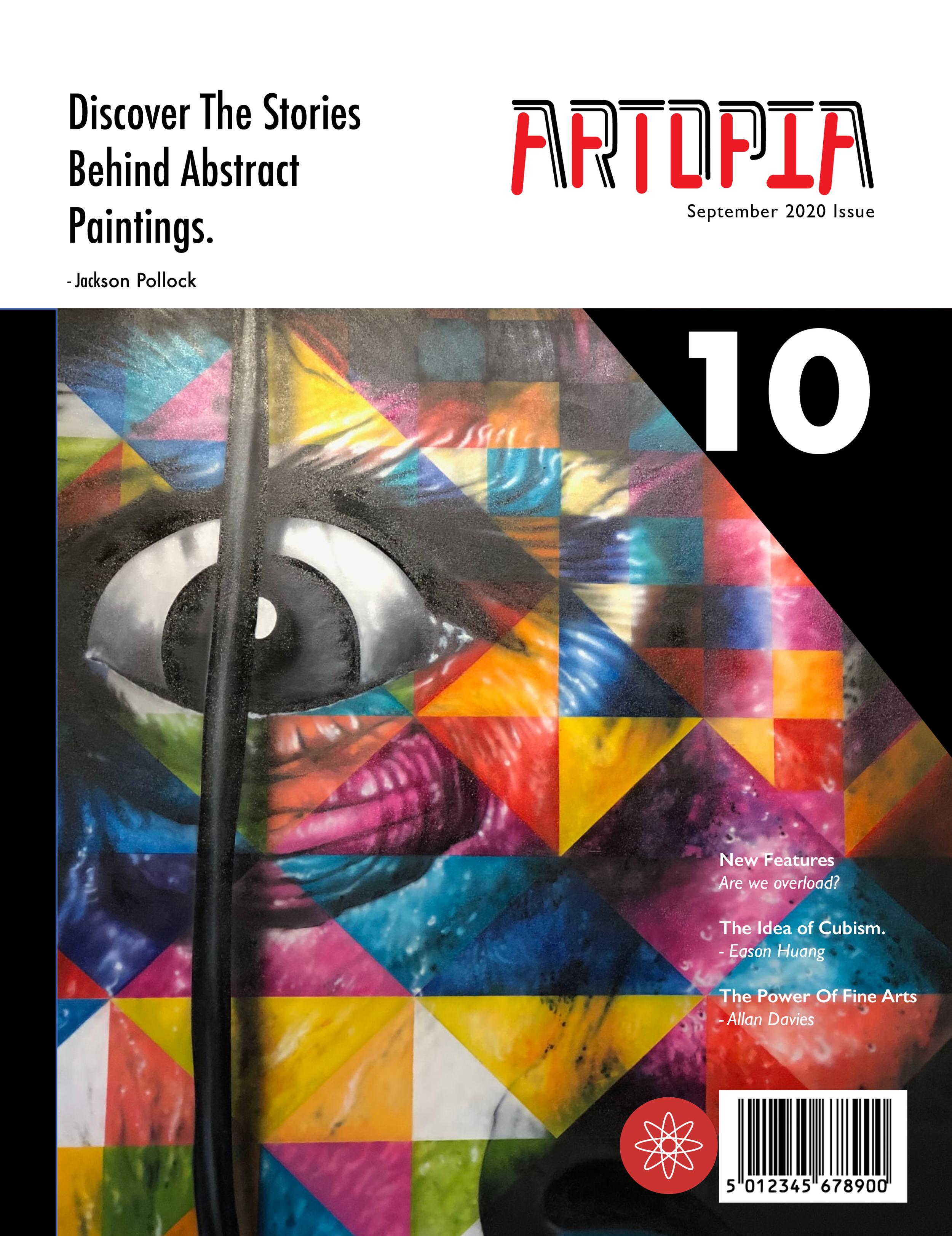
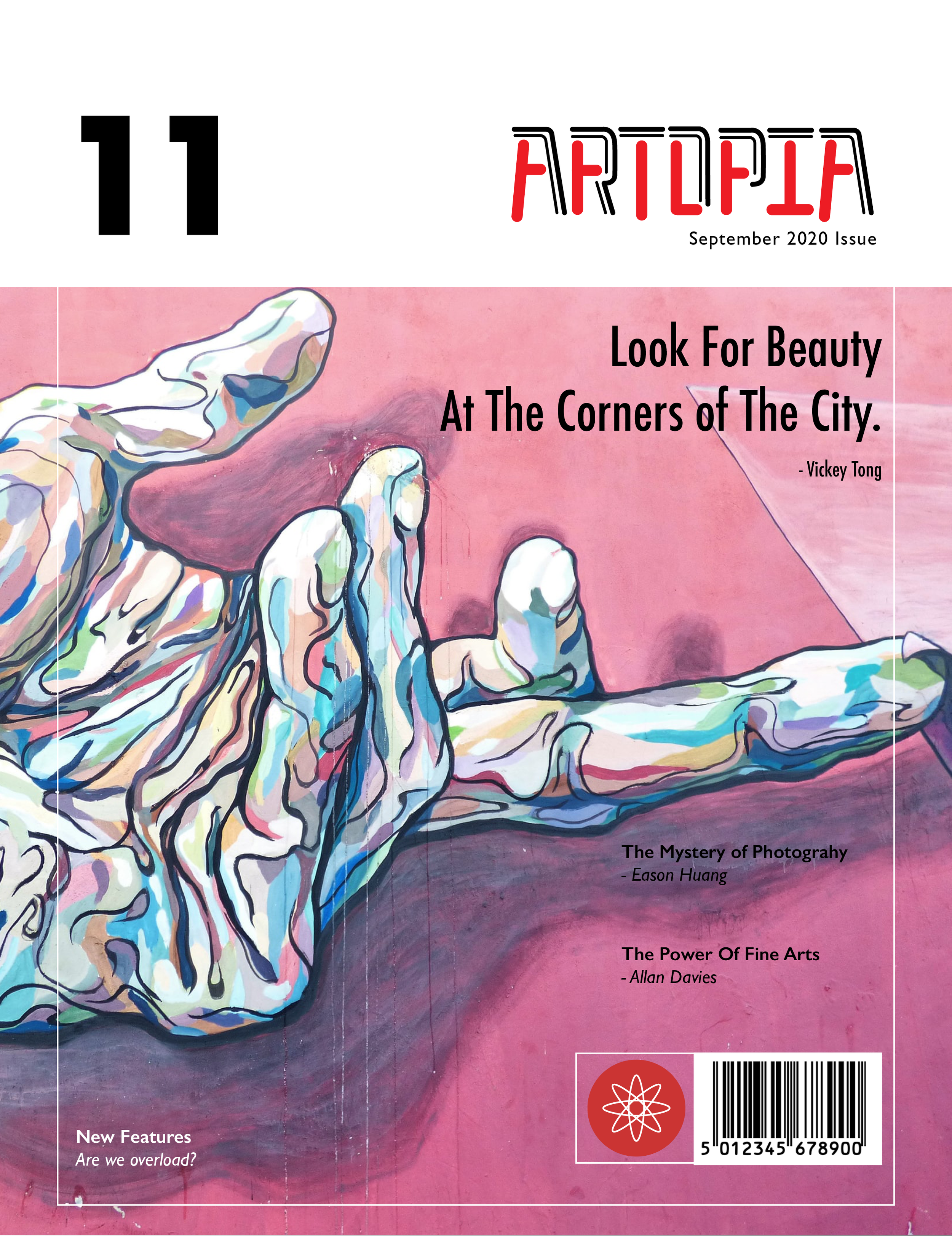
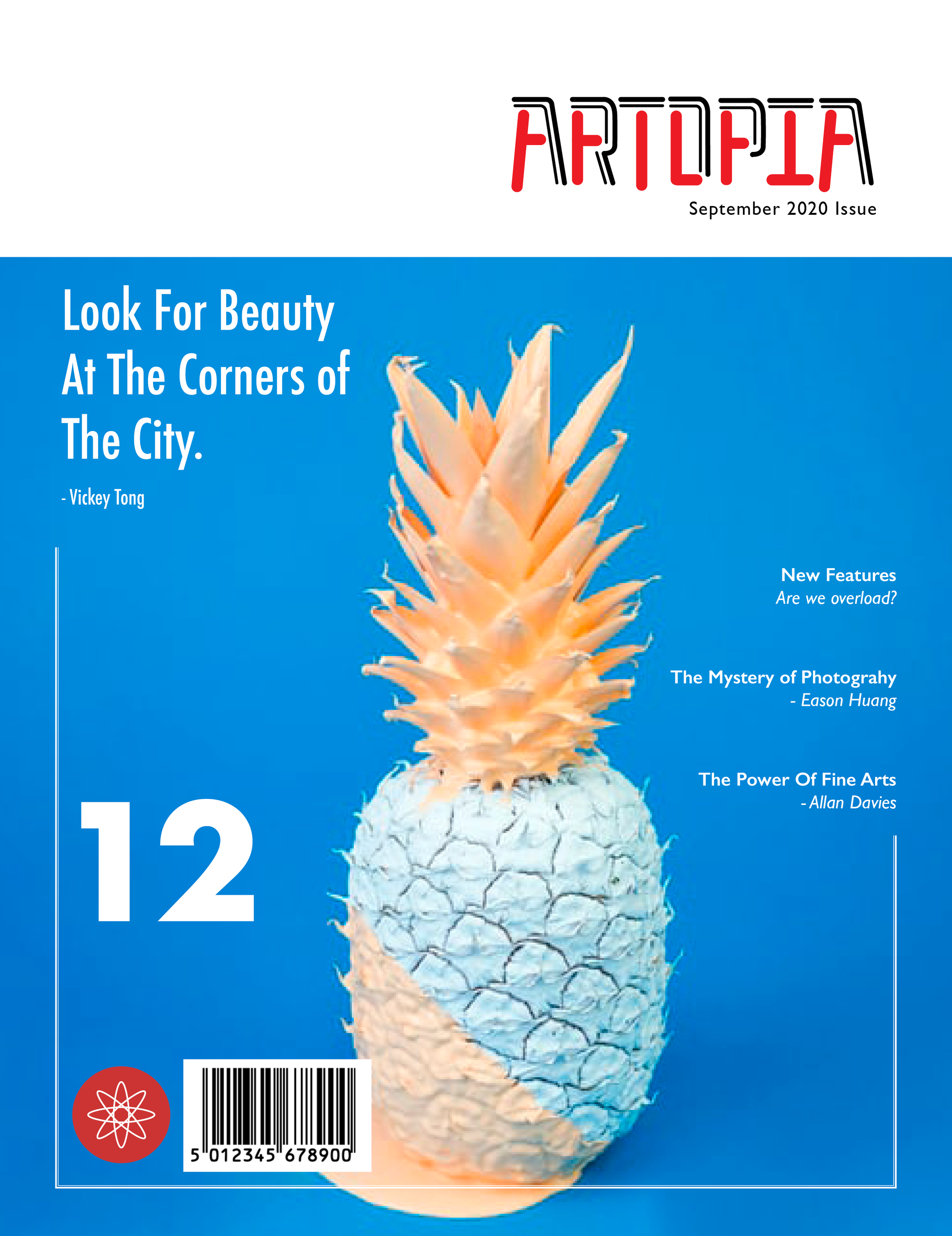
The name that was chosen for this fine arts magazine is Artopia, which is a conjunction word comprising “art” and “utopia.” This name is in reference to the perfect collection of art pieces within the magazine.
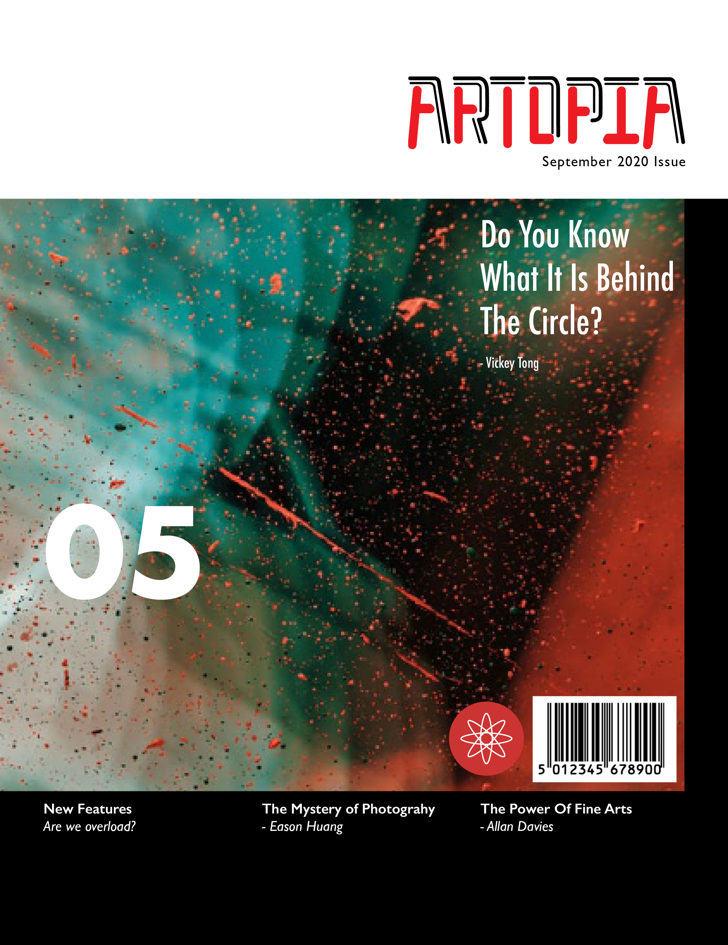
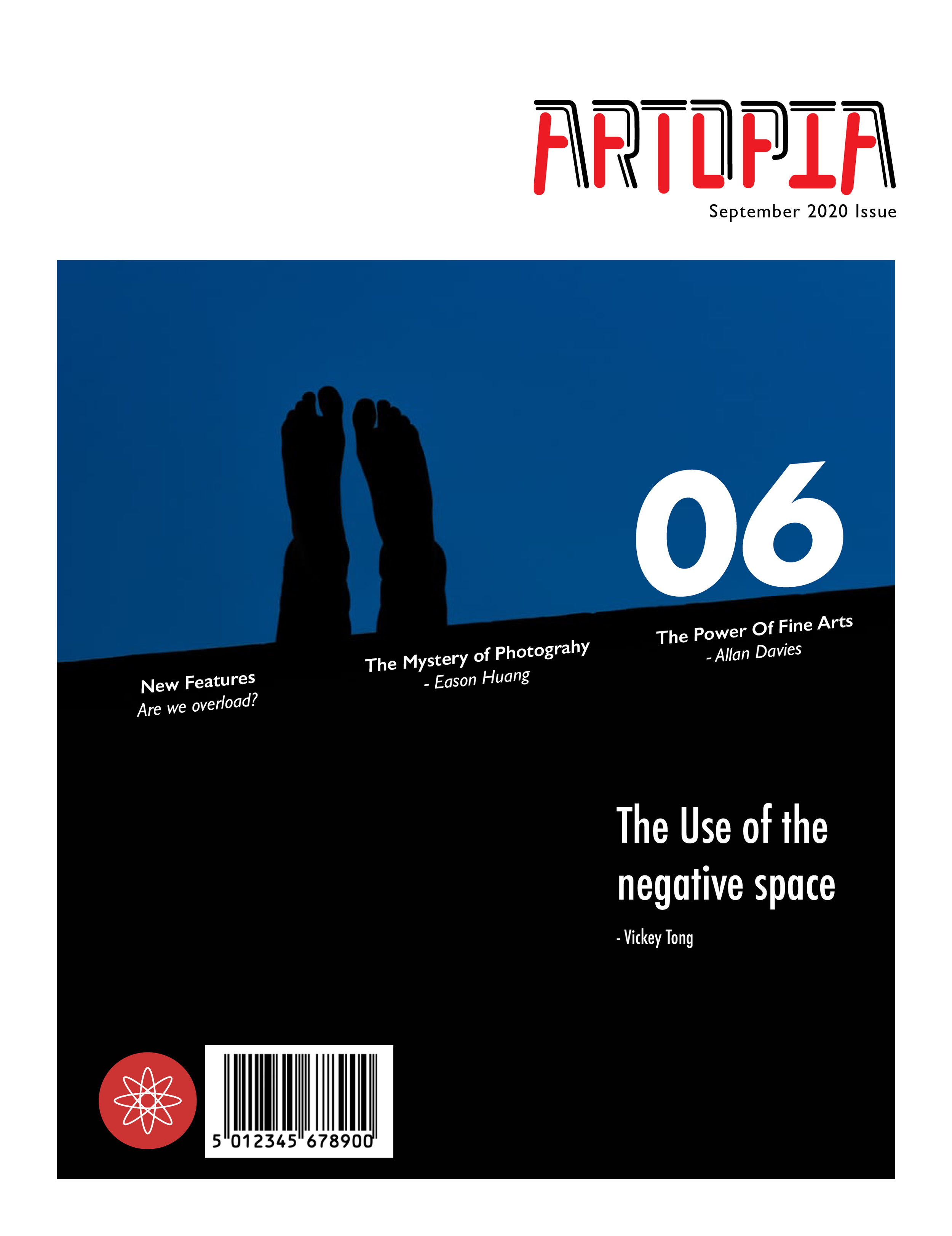
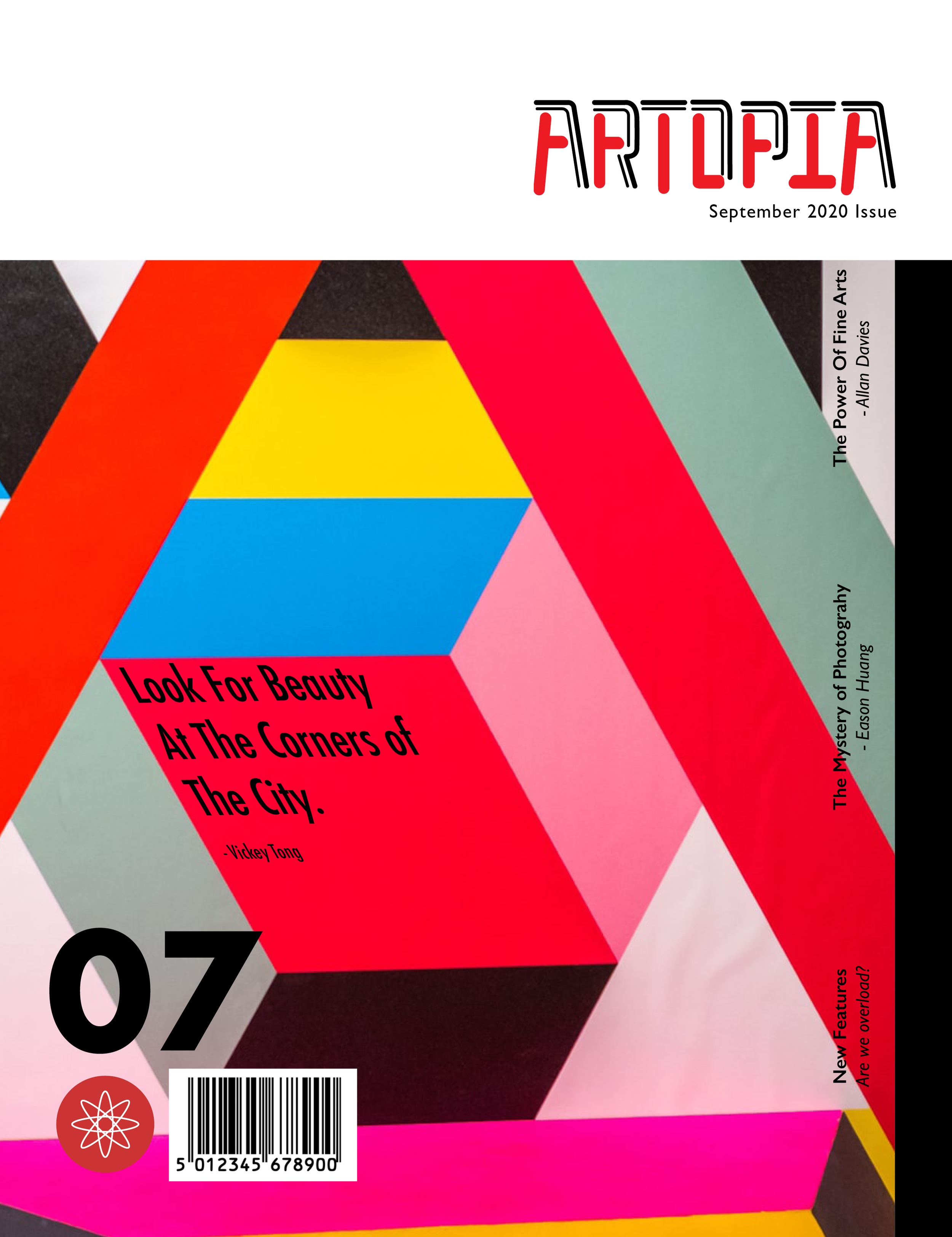
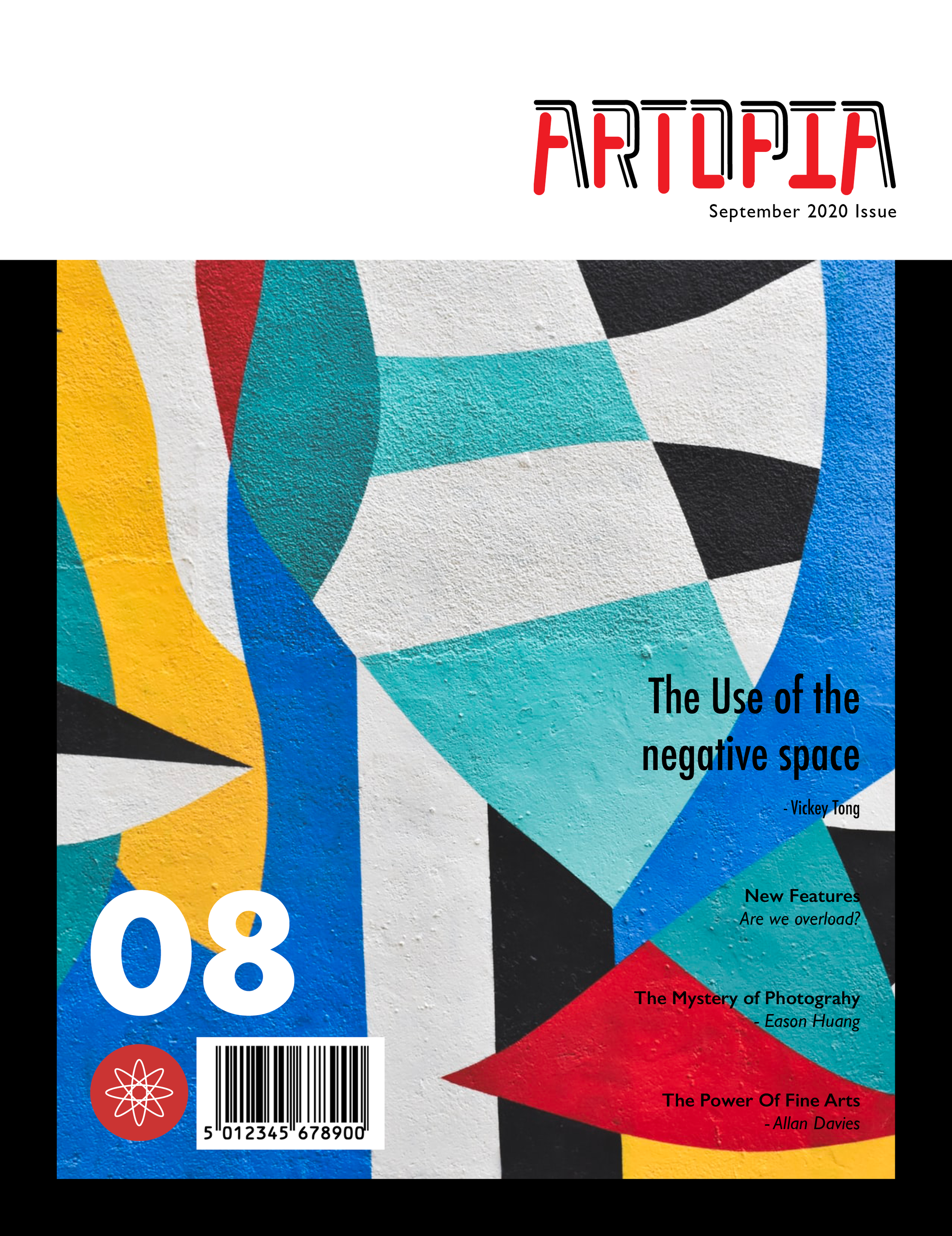
Artopia is designed for adults above 35 years old who have an interest in fine arts. The design choices reflect the elegant and artsy characteristics of the target group. As for the nameplate, the combination of thick and thin strokes represents the variety of the arts collections within the magazine and the multiple personalities that a piece of artwork can contain. The nameplate is flush right, and appears in the top third of the cover. The issue number and date is discreetly displayed below the nameplate. As for the icon, there are three circles overlapping each other in a circle, which represents the magazine’s international focus. Complementing the bold and contemporary attitude of the magazine, black dominates large portions of the cover page, leaving red as the magazine’s secondary colour.
The covers
The layout